Crafting a path for Charlotte NC’s outdoors focused brewery.
Blue Blaze Brewing Co.

Crafting a path for Charlotte NC’s outdoors focused brewery.
Blue Blaze Brewing Co.
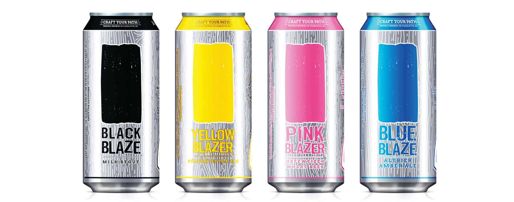
Blue Blaze Brewing Company is a craft brewery in Charlotte, NC, focused on promoting the hiking and outdoor lifestyle. In the spring of 2014, Blue Blaze’s owners approached Sublmnl to discuss branding and their intentions to bring a taste of the wilderness to the big city. We created the brand with this notion in mind throughout the development process.
A “blaze” is a marking system (usually a paint mark on a tree or rock) that helps hikers follow a given path. It’s used to indicate things such as the beginning and end of a trail, a change of direction, an intersection with another trail, a path to the water, etc. We tied this concept into the brand’s overall image, with the primary logo having an actual blaze shape. We furthered this tie into the trail systems using the same fonts and arrow treatments the National Park Service used on their trailhead signage. Each beer in their core lineup is named after a different blaze color and follows the bold color schemes used to catch attention in the forest.
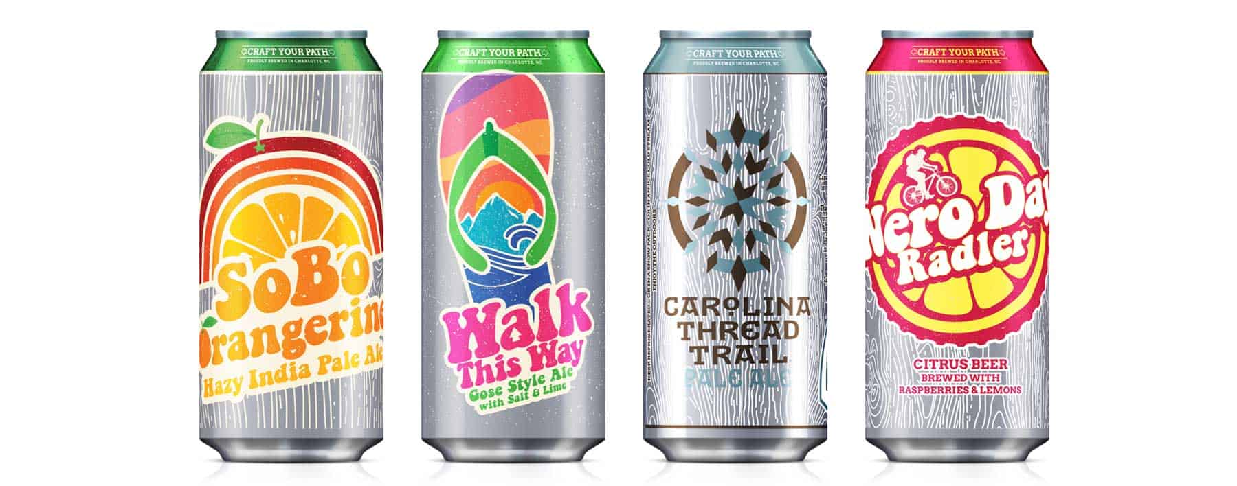
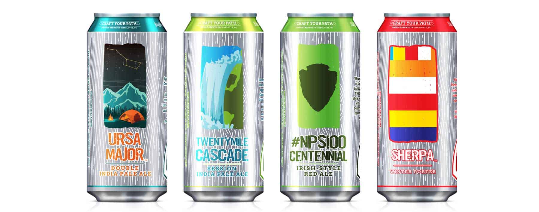
When we began developing the product packaging, we decided to go in a more exciting and modern direction by dropping the color out of the labels and letting the brightness of the aluminum cans shine through (which, at the time, was something no one else in the craft beer segment was doing). The BBB brand image is rooted in the outdoors but has a modern twist. It’s a distinctive brand image in the North Carolina beer scene. It continues to stand out from its competitors after almost 10 years of retail presence.