An identity refresh for an iconic Charlotte, NC brand.
106.5 The End (WEND)

An identity refresh for an iconic Charlotte, NC brand.
106.5 The End (WEND)
106.5 The End has been an iconic brand in the greater Charlotte, NC, area for over 30 years. For many listeners, it’s not just a radio station; it’s the soundtrack to their daily lives. It’s an institution. That meant we had a real challenge ahead: honor the brand’s legacy while creating something new that would resonate with the station’s next generation of listeners.
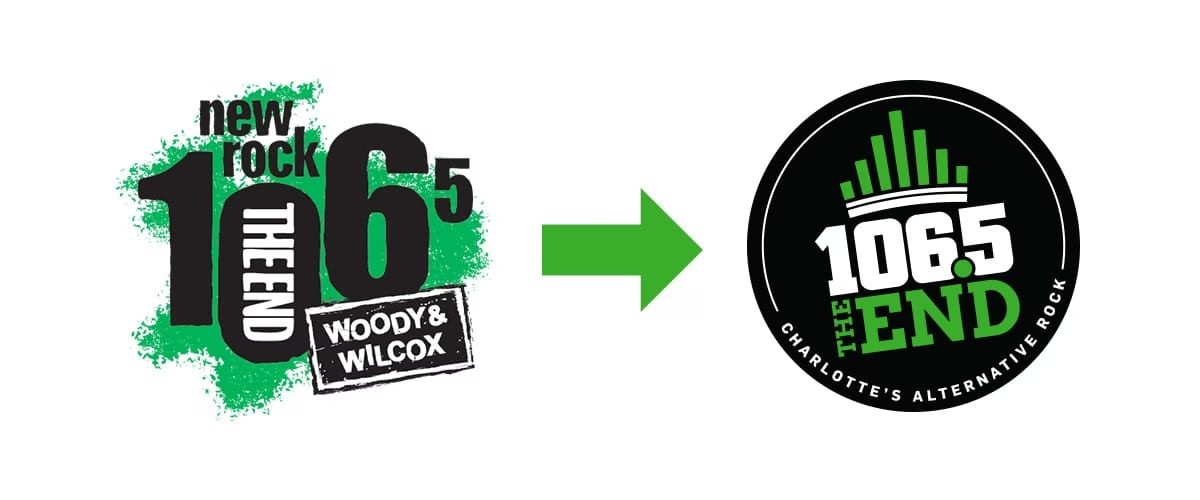
A Charlotte Institution
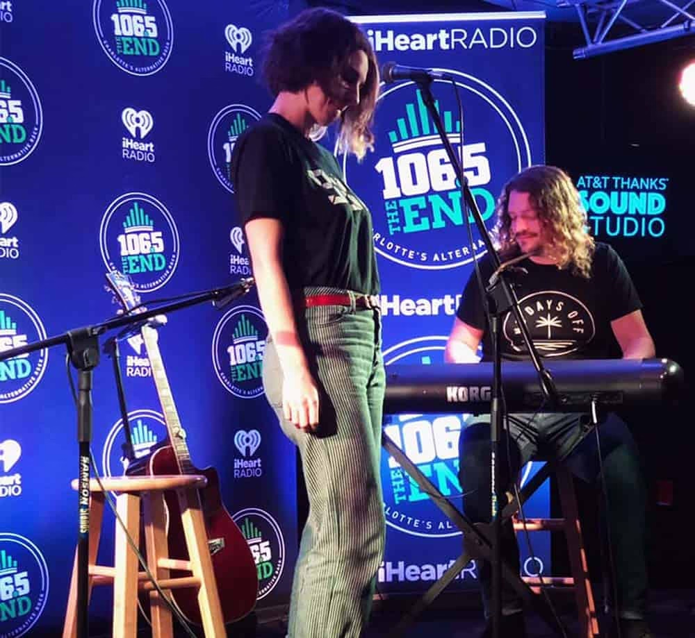
After a format change and rebrand into an “alternative rock” station in 1995, 106.5 quickly became the go-to for a new generation of listeners looking for something different from Top 40 pop radio. As grunge took hold, the station filled a genuinely trendy niche and has remained at the top of the greater Charlotte area’s ratings ever since, now broadcasting worldwide via the iHeartRadio app.
The Challenge
iHeartMedia acquired the station in 2015, and by 2018 it was clear a new visual identity was needed to match the station’s evolving direction. The grunge era had long passed, but the brand image was still stuck in 1995, and both the station’s audience and the definition of “alternative rock” itself had shifted significantly. It’s a challenge many legacy media brands face today: how do you modernize a beloved, decades-old identity for a streaming-first, multi-platform world without losing what made people love it in the first place? The iHeartMedia team brought Sublmnl on to solve exactly that.
A New Twist on a Charlotte Icon
Charlotte, NC, is affectionately known as the “Queen City,” named for Britain’s Queen Charlotte in 1761, and the image of a crown has become instantly recognizable as quintessentially Charlotte. With 106.5’s reach now extending well beyond the Charlotte market through worldwide streaming on the iHeartRadio app, we knew the new identity needed to feel unmistakably Charlotte to listeners worldwide.
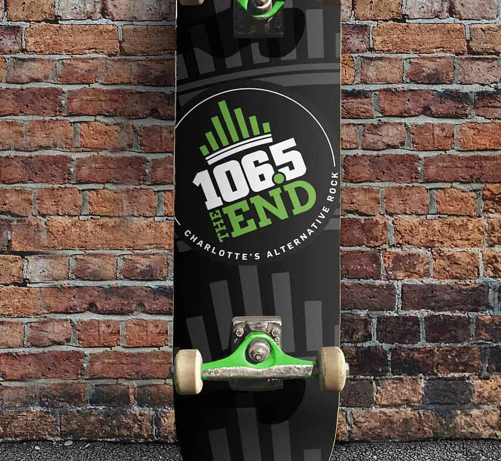
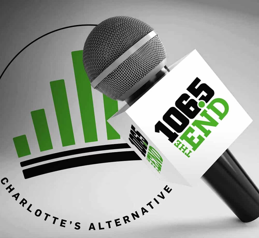
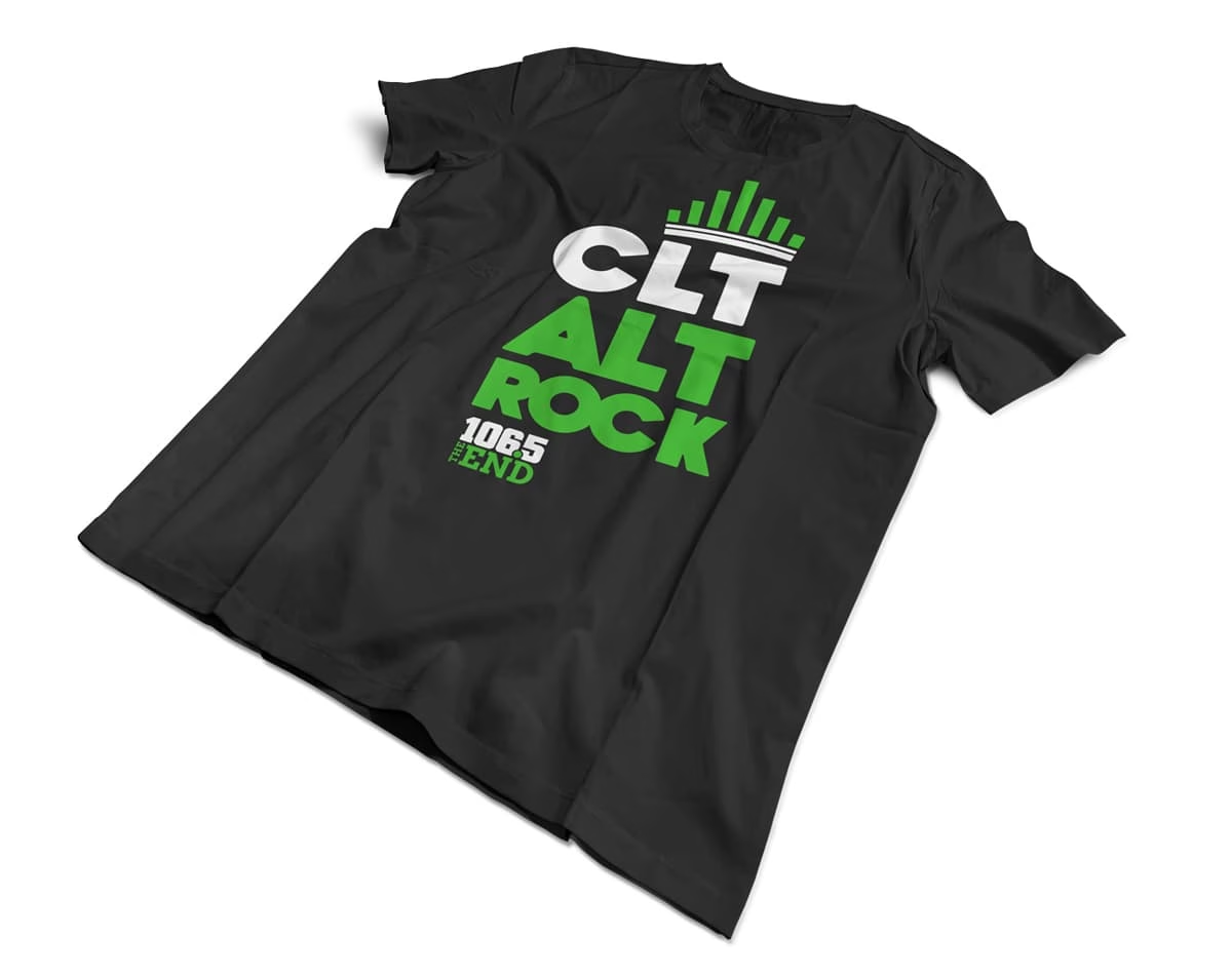
So we asked a simple question: what actually connects the idea of a crown to a radio station? We found our answer on a visit to iHeartMedia’s Charlotte studios. Walking through the production areas, one visual was everywhere: decibel level meters; the rising and falling bars representing the exact sound being broadcast to listeners in real time. That was the idea. The crown’s “horns” became undulating bars representing audio decibel levels, an image that instantly reads as both a crown and a radio broadcast, and unmistakably “Charlotte radio.”
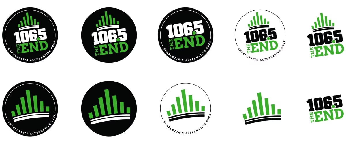
Refining the Mark
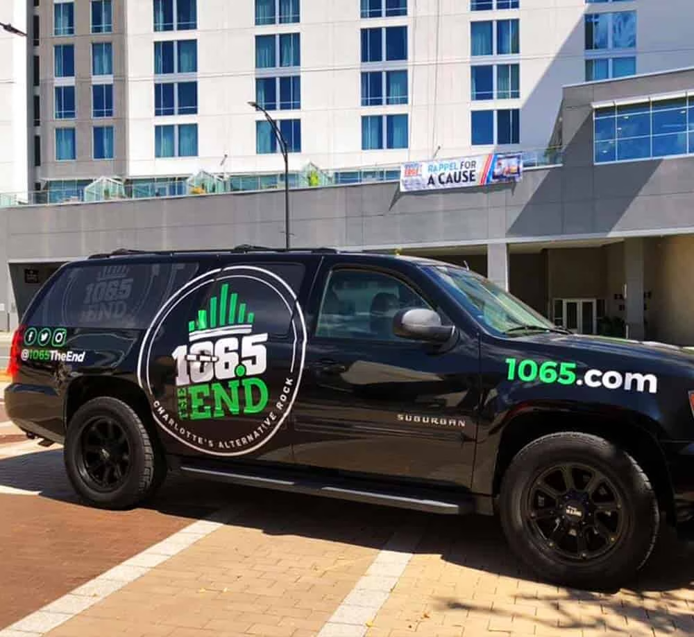
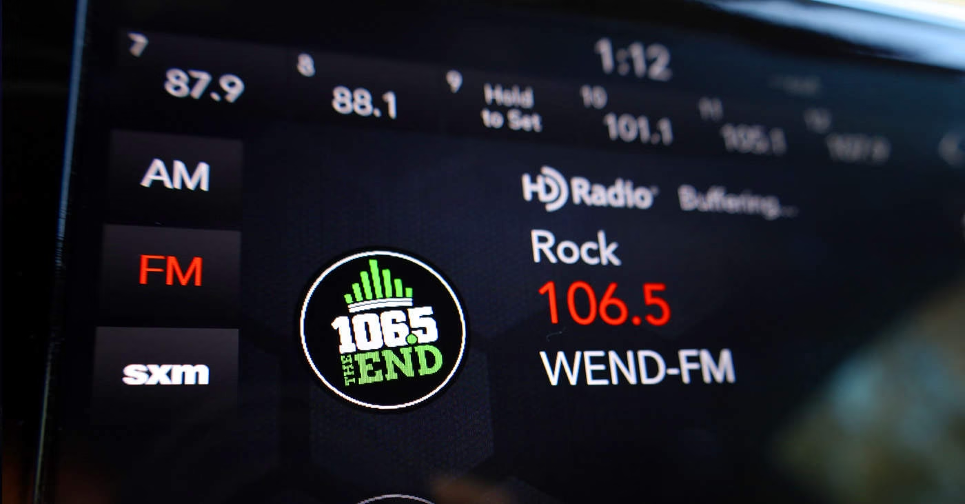
With the concept locked in, we refined the supporting typography: a bold, rounded treatment for the “106.5” call sign built for legibility at any size, paired with an assertive block serif for “The End” to create visual contrast. We kept the green, black, and white color palette the brand has used since 1995, preserving familiarity and heritage. We tilted the final mark slightly upward, symbolizing the brand’s continued forward momentum in Charlotte’s alternative rock scene.
The Result
The refreshed identity pays homage to 106.5’s 30-plus years of history while giving the station a modern, distinctive mark built for a broadcast landscape that now spans traditional radio, streaming apps, and digital platforms alike. Proof that a legacy brand refresh doesn’t require abandoning what made the brand iconic in the first place.