Evolving a neighborhood brewery’s brand presence.
Town Brewing Co.

Evolving a neighborhood brewery’s brand presence.
Town Brewing Co.
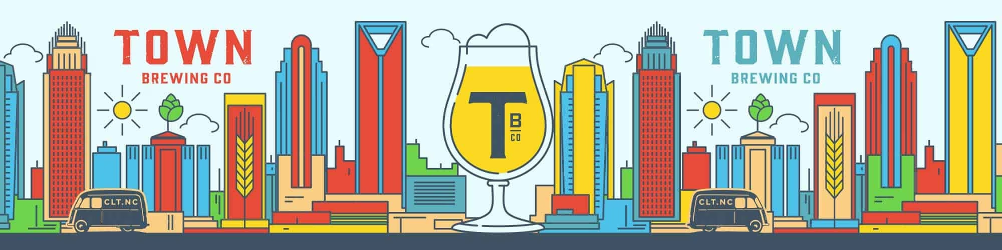
Town Brewing Company is one of Charlotte, NC’s most successful neighborhood breweries, located in the trendy Freemore West neighborhood. Town positioned itself as the neighborhood brewery right out of the gate, and after a successful first year, it was time to evolve the brand to match the growing energy of both the neighborhood and the brand itself. The goal: give Town a bigger, more exciting presence beyond just their corner of “town.”
The Challenge
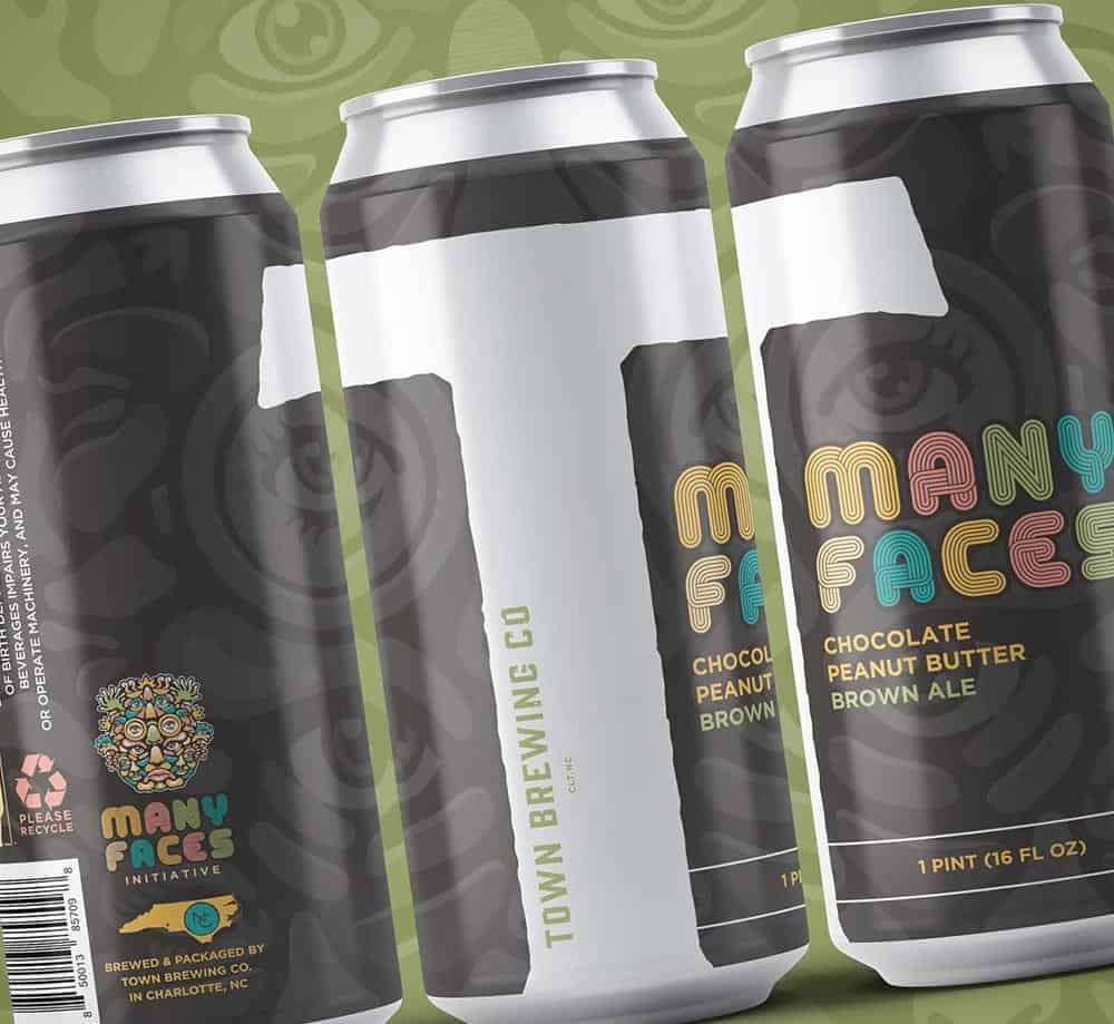
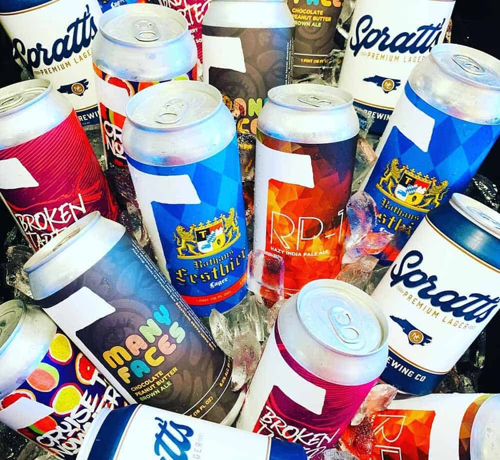
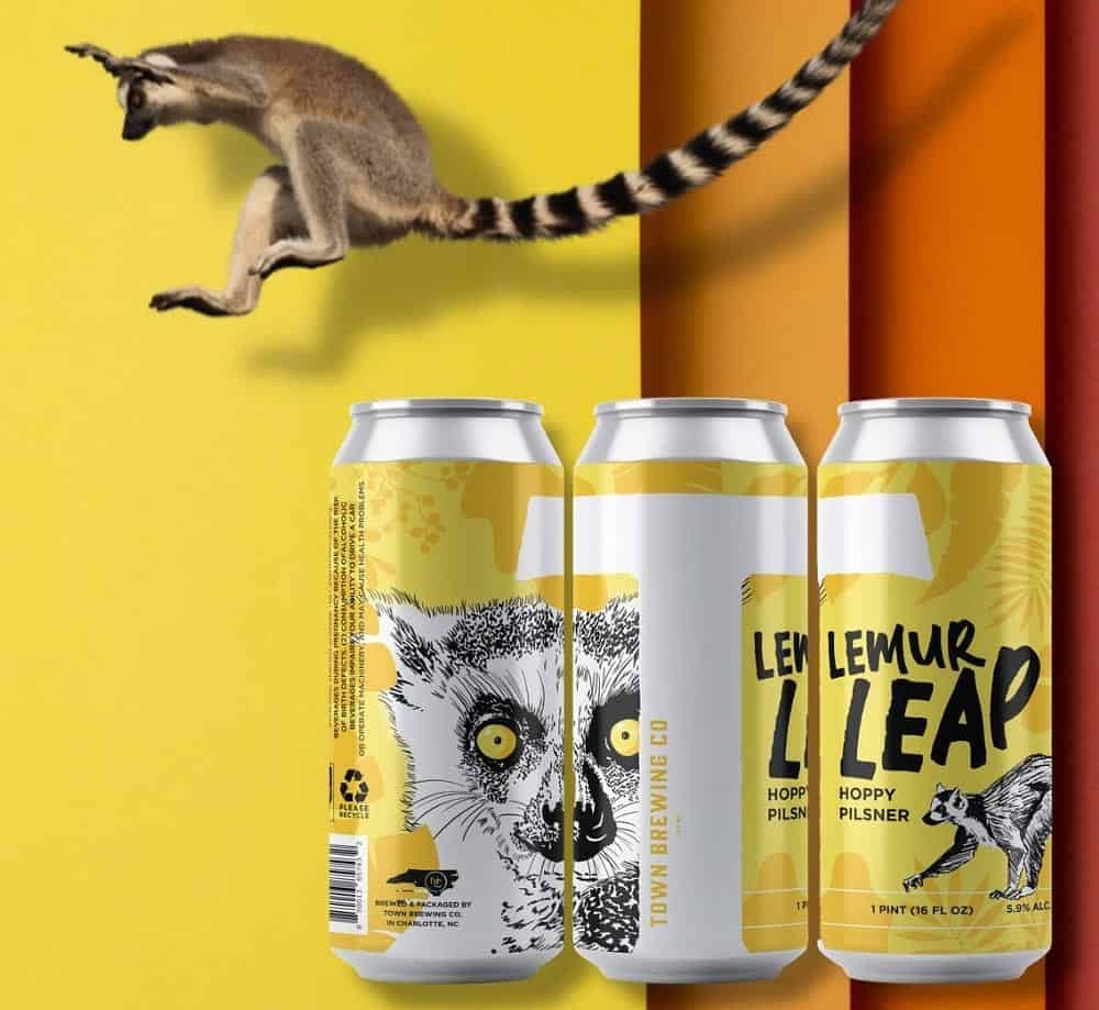
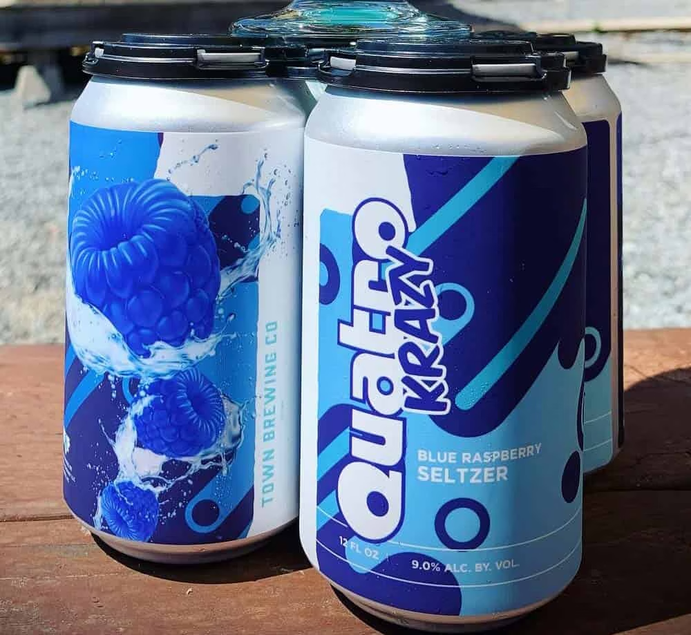
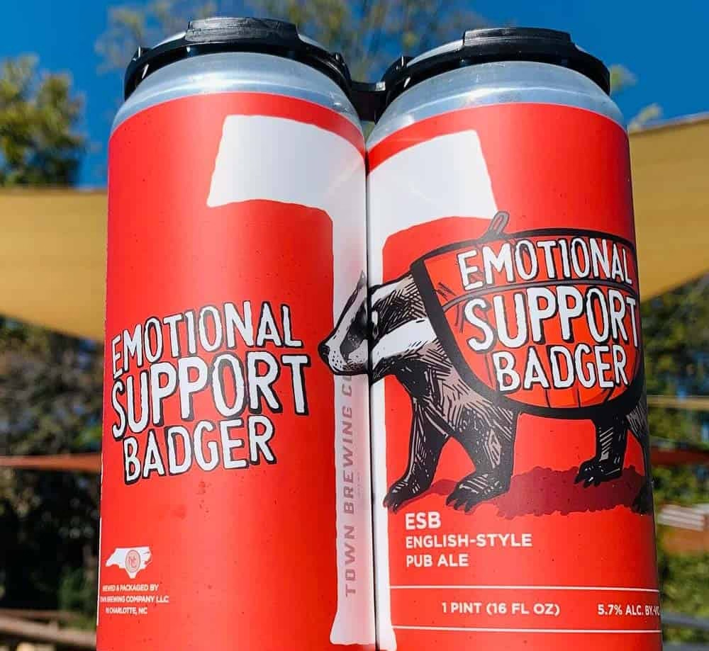
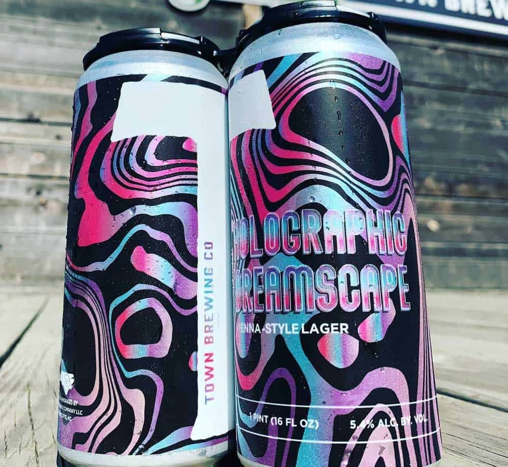
Town’s original brand was built around a tightly controlled system: strict color usage, type treatments, and imagery, which worked well for a grand opening but became a limitation once the brewery set its sights on retail expansion and wider distribution. As breweries scale from a single taproom to shelf presence across a growing footprint, packaging needs to flex to support new can designs, seasonal releases, and sub-brands, without losing brand consistency; a challenge facing nearly every craft brewery moving from local favorite to regional player.
A Flexible Packaging System
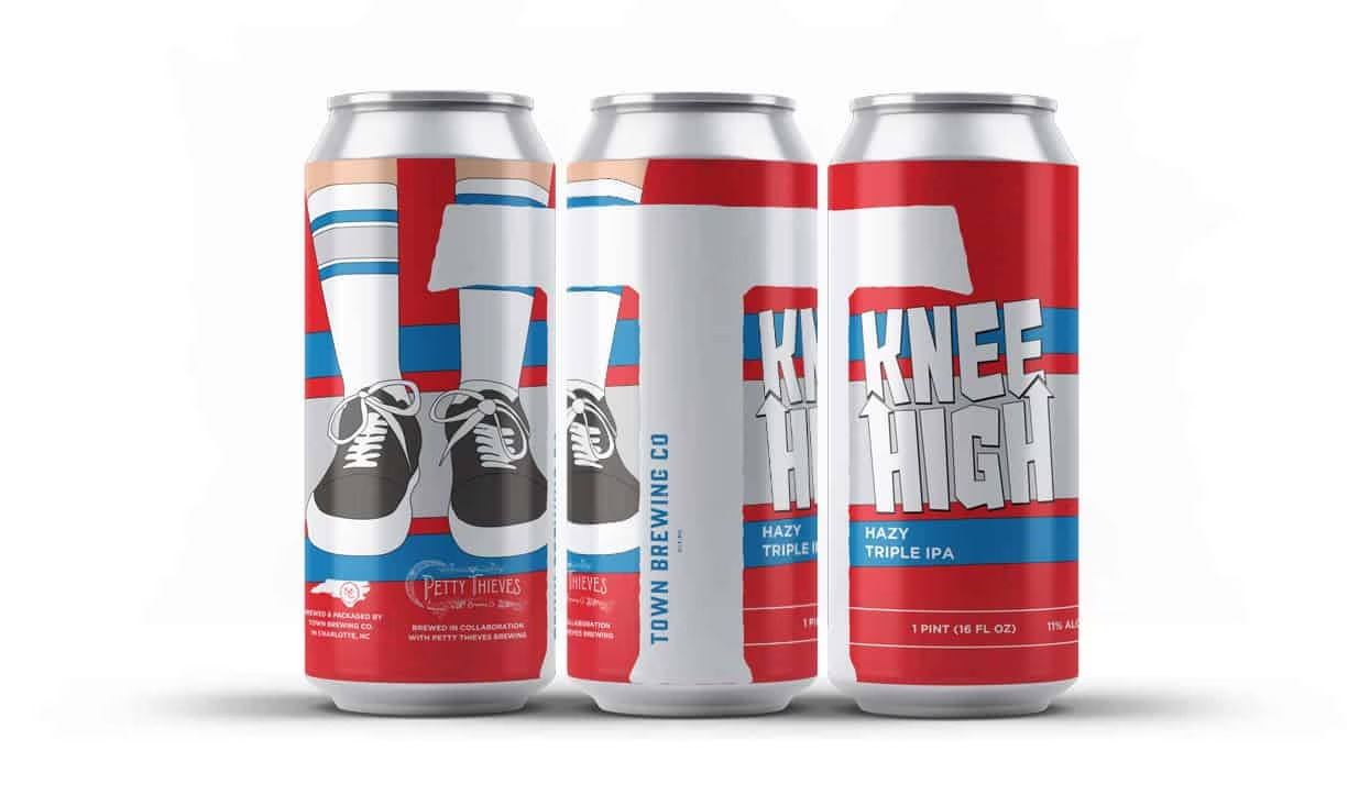
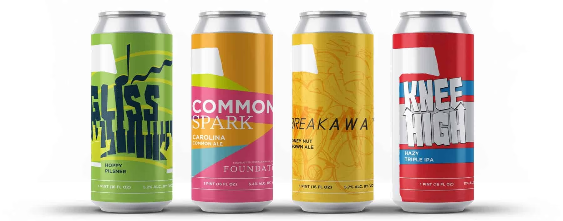
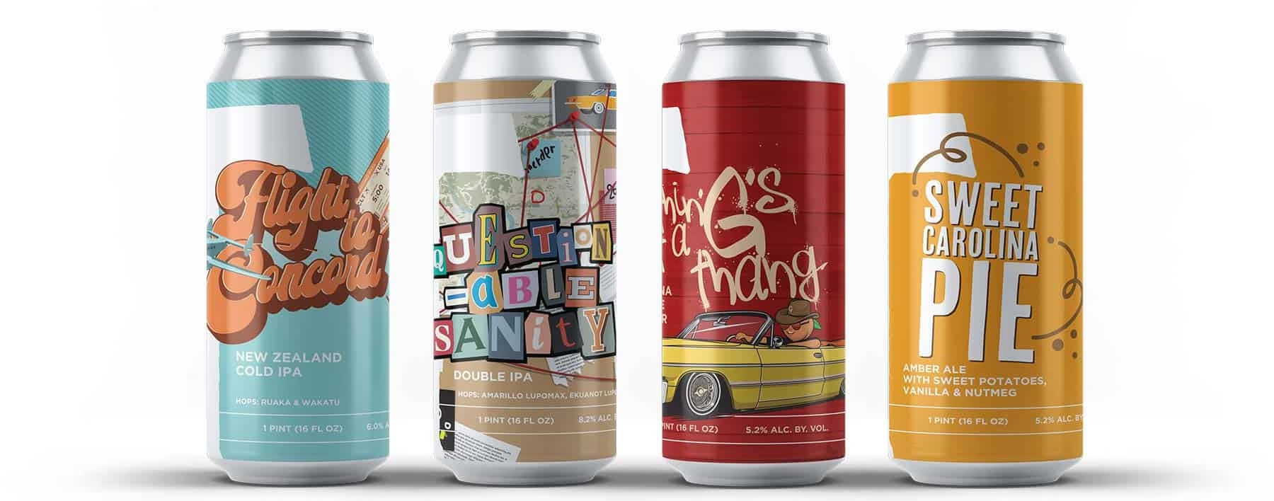
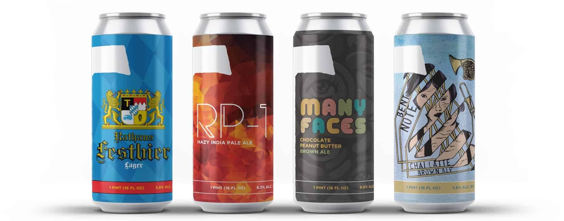
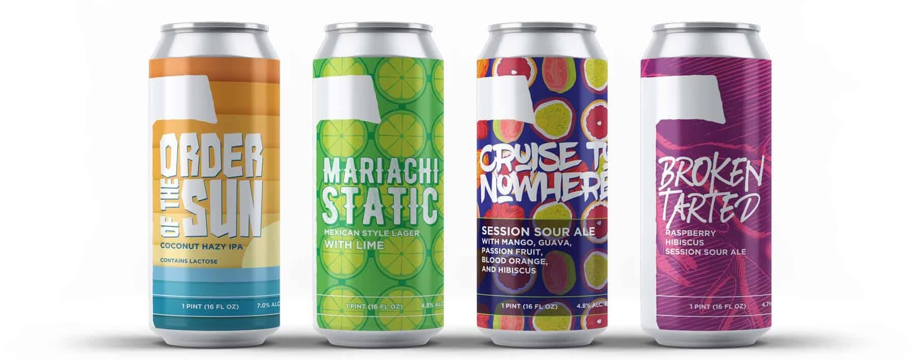
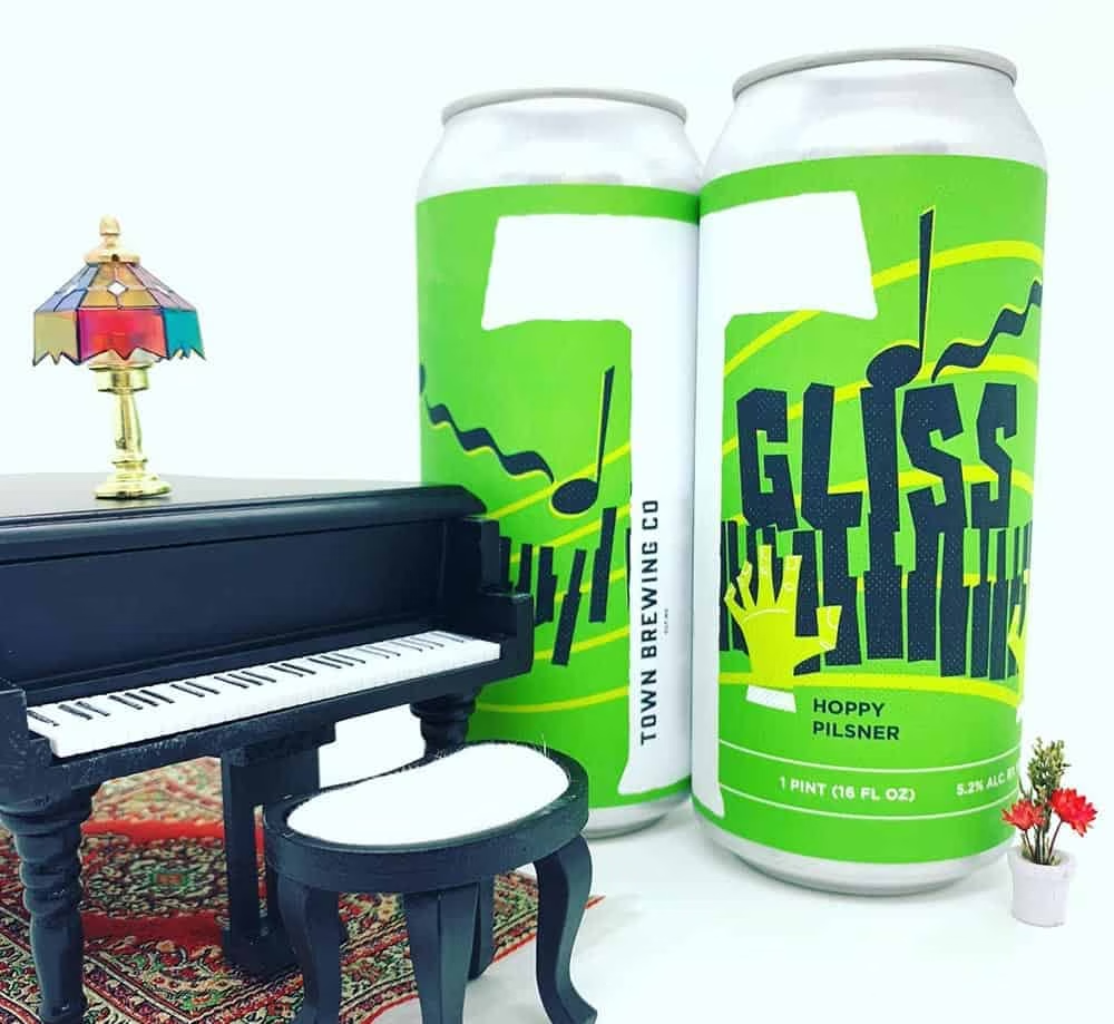
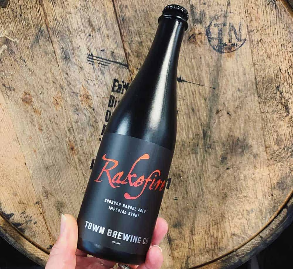
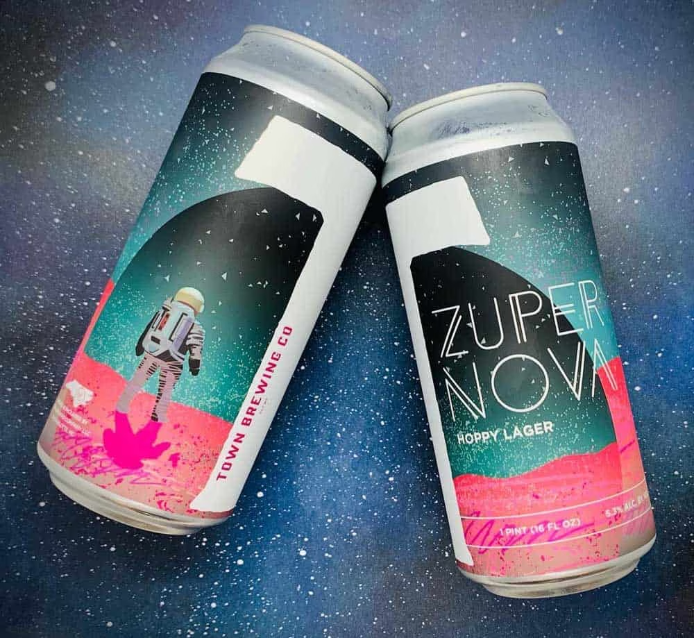
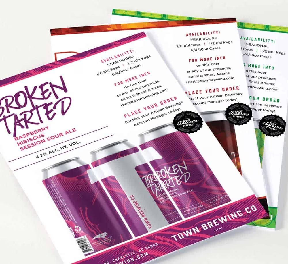
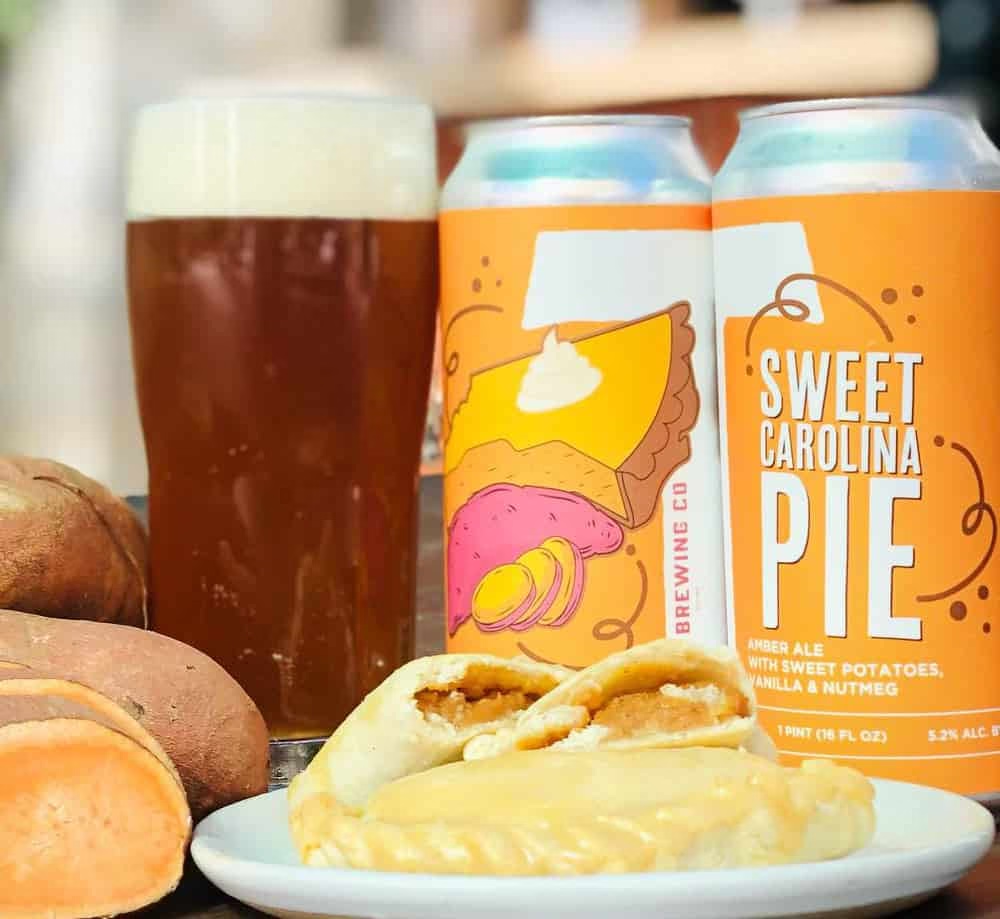
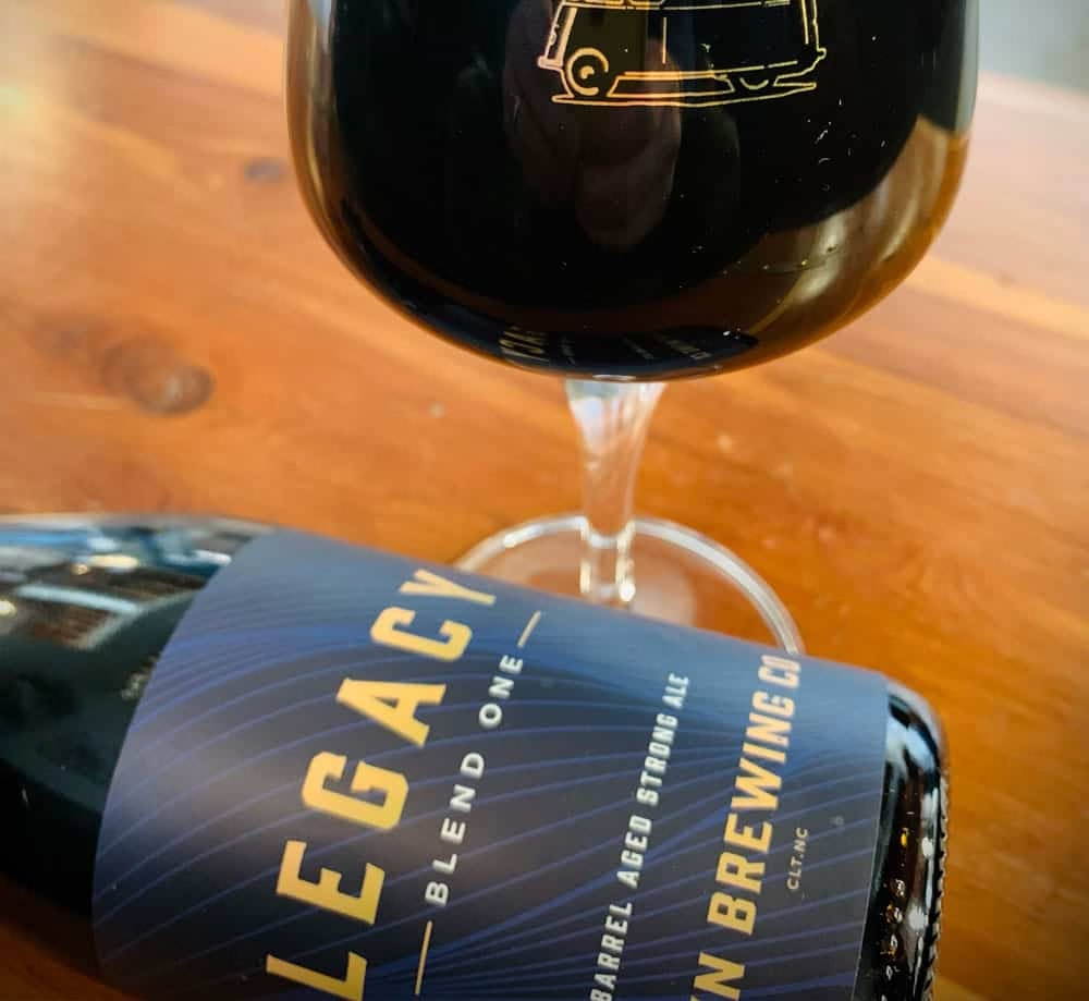
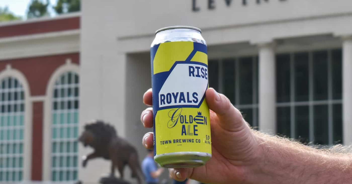
Rather than a single rigid look, Sublmnl developed (and continues to develop) a flexible packaging architecture for Town — a system built to let different art styles and type treatments live within one consistent brand framework. This approach reflects a broader shift in craft beverage packaging: instead of one static design applied to every release, breweries increasingly need modular systems that support creative variety while still feeling unmistakably on-brand on the shelf.
Expanding the Brand Family
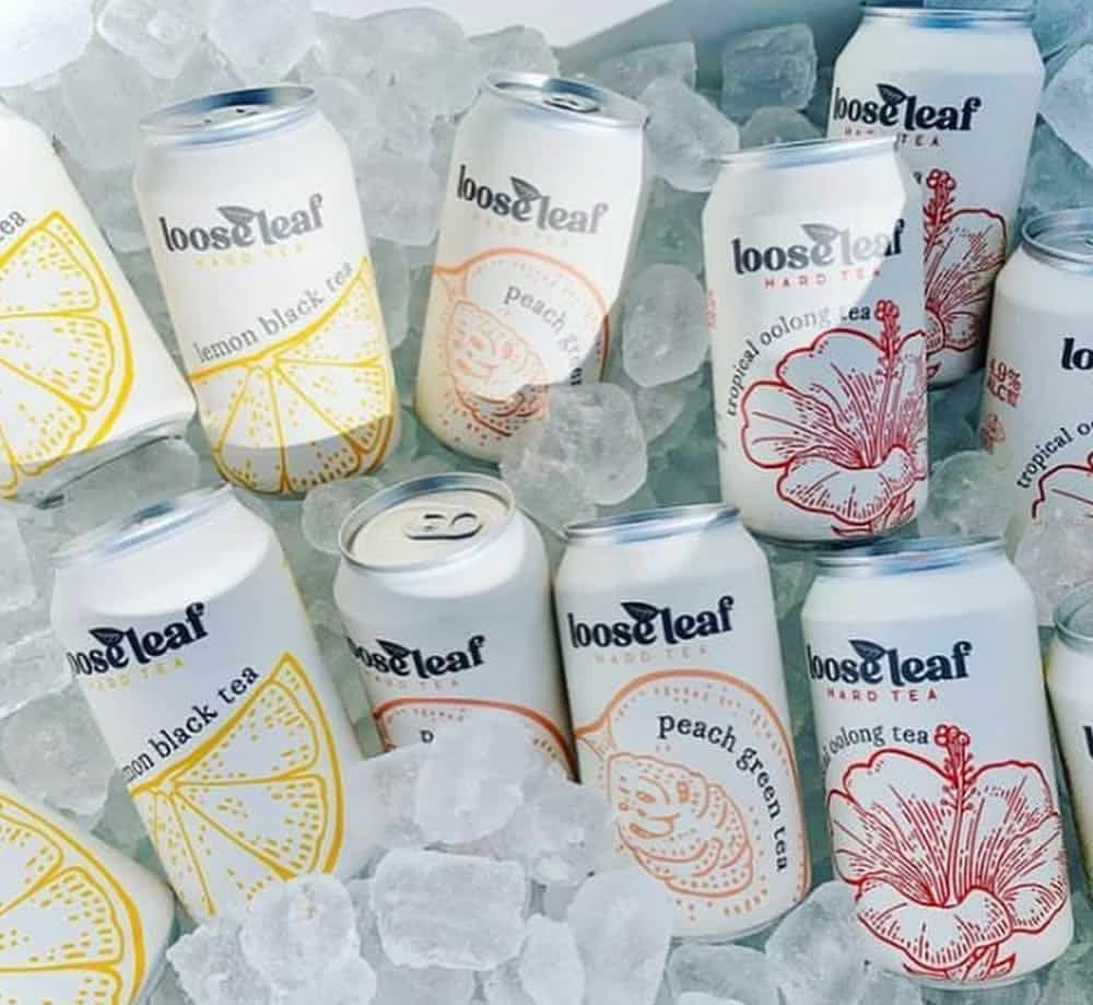
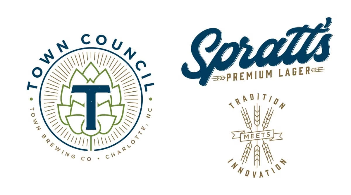
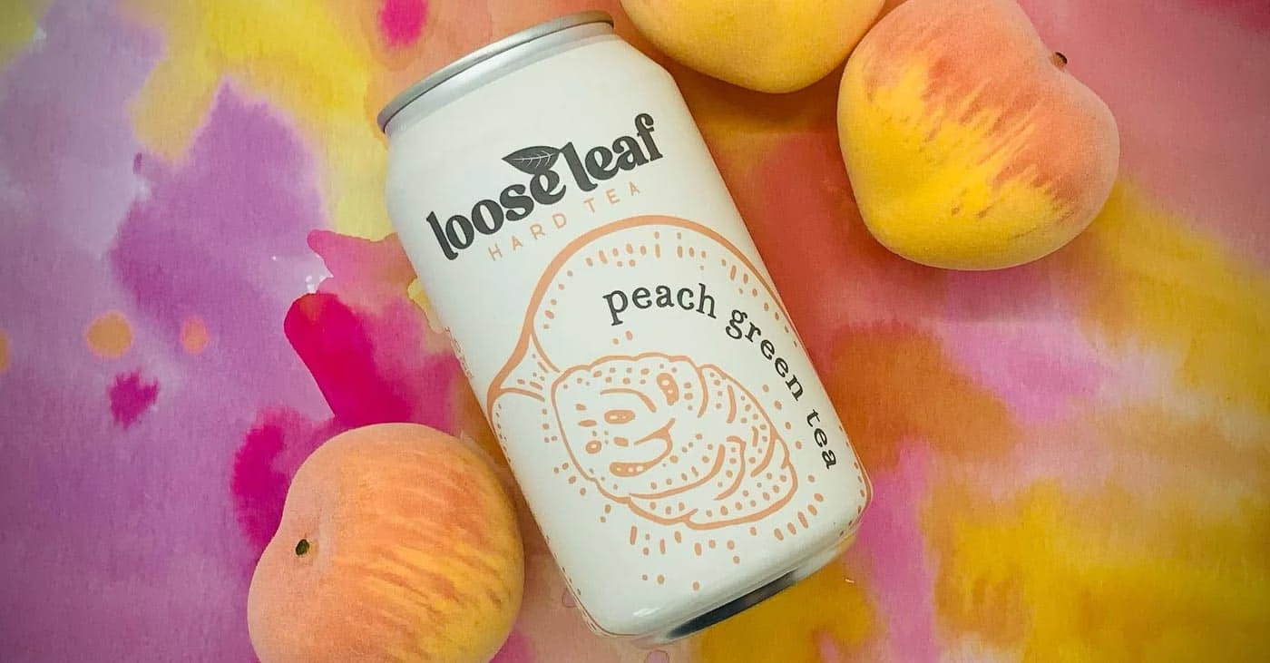
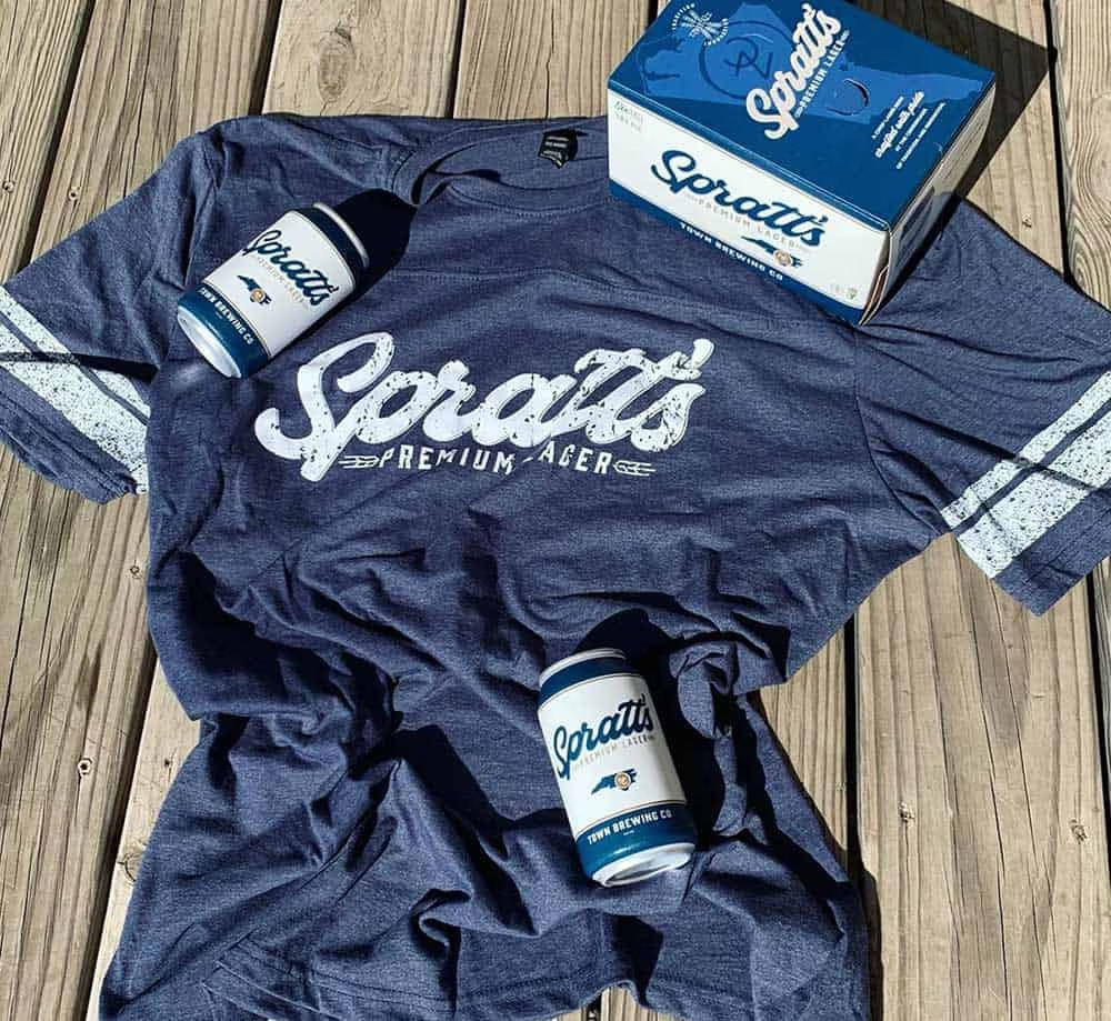
Beyond Town’s core identity, we’ve helped the brand grow through sub-brand development — building distinct identities for Spratt’s Premium Lager, Loose Leaf Hard Tea (tapping into the fast-growing ready-to-drink and hard tea category), and a private-label beer brand created for Queens University. This kind of brand architecture — a strong parent brand supporting multiple distinct sub-brands — has become an increasingly common growth strategy for craft breweries looking to diversify beyond their flagship beer lineup.
The Result
The work has been well received both locally and across Town’s growing distribution footprint, helping the brand stand out in an increasingly competitive retail market. Town Brewing is more than a neighborhood brewery today — and we’re proud to have played a role in that growth.