Home » 106.5 The End: Rebranding A Charlotte, NC Icon
106.5 The End (WEND) has been an iconic brand in the greater Charlotte, NC area for over 25 years, and to many it’s not just a radio station, it’s the soundtrack to their daily lives. In other words, it’s an institution and we had a big job ahead to pay homage to the legacy of the brand while also creating something new that would resonate with their listener base.
After a format change and rebranding into an “alternative rock” station in 1995, 106.5 quickly became the go-to for a new generation of listeners who were looking for something different from the every day Top 40s pop radio. As the “grunge” era was beginning to take hold, 106.5 filled an incredibly popular niche, and has remained at the top of the greater Charlotte, NC area network ratings list since its inception. Today, it’s still at the top of the area charts and is also broadcast all over the world via the iHeartRadio app.
The station was acquired by iHeartMedia in 2015, and by 2018 it was very apparent that a new image was needed to reflect the new direction of the station. The grunge era had long passed, yet the brand image was still stuck in 1995. The station’s demographic and the definition of what is now considered “alternative rock” was quickly changing, and there was a major need for a new look to reflect a more modern direction. The team at iHeartMedia reached out and Sublmnl was happy to work with them on the rebranding process. In the end (<– see what we did there? ;)), we delivered an entirely new identity that pays homage to 106.5’s past, but more importantly, provides a new direction for their future.

A New Twist On A CLT Icon
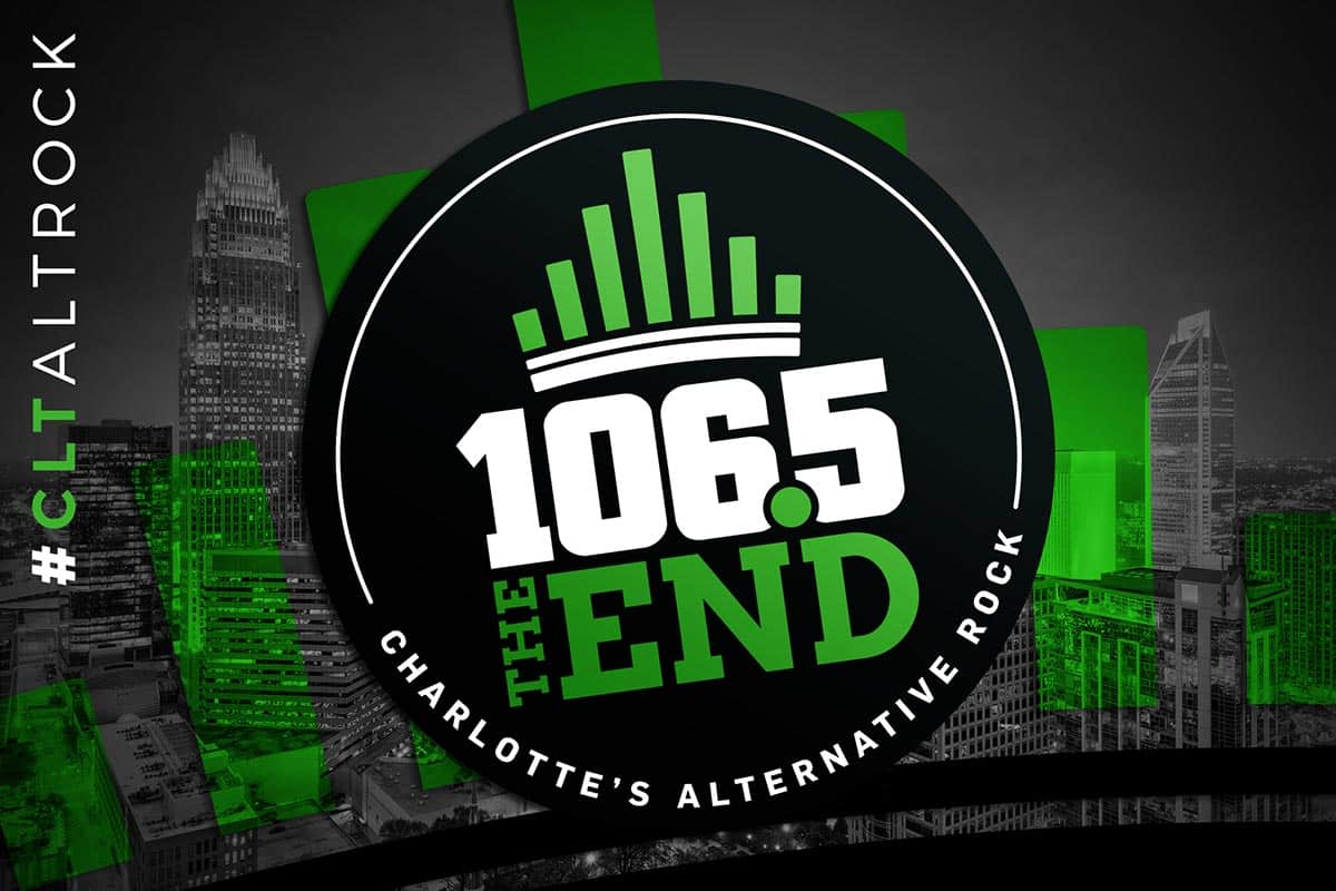
Charlotte, NC is affectionately known as the “Queen City” due to being named after Britain’s Queen Charlotte in 1761. The image of a crown has become synonymous with the city and is instantly recognizable as something that is quintessentially “Charlotte” to anyone who has ever stepped foot in the area. Because of this, we took the idea of the crown as the basis for the direction of the brand development to create something that is unquestionably “Charlotte.” This was an incredibly important point to drive home given the wider reach now possible through the iHeartRadio worldwide streaming app.
While we had a direction for the development, we still needed to deconstruct the idea of “what forms a crown?” The obvious direction would’ve been to go the literal route and pop a crown on top of the type and call it a day. That’s probably what most brands in the radio realm would have done, because let’s be honest, most radio station logos out there are pretty rough. (We know you have seen a few bad ones, don’t lie to yourself.) So in order to set the brand apart from the competition – and the typical branding you would expect from a radio station – we decided to break it down and determine what makes the concept of a crown and radio station make sense at first glance? We arrived at the answer to that question during a trip to the iHeartMedia Charlotte, NC offices to see their broadcast studios and get the behind the scenes tour.
In the production areas and studios there is one constant you see everywhere you look: decibel level meters. Upon seeing these lines going up and down all around us representing the transmission that the listeners were hearing on their radios, we knew we had a winning idea. After presenting the initial concepts to the iHeartMedia team, it turns out we were right. We did have a winner. The crown’s “horns” are formed by undulating bars meant to represent the audio decibel levels that are broadcast from the radio station. It’s an image that immediately brings home the notion of being “Charlotte radio.”
Once we had the overall concept of the new mark nailed down, we cleaned up the rest of the new image with a big, bold type treatment for the “106.5” call sign that would be legible and stand out at any size. We then used a bold block serif treatment for the accompanying, “The End” monicker to juxtapose it against the roundness of the main call sign type. We kept the same green/black/white color scheme that has been in use since 1995 as a way of paying homage to the history of the brand, and lending some familiarity to the new image. Finally, we tilted the mark at a slight angle facing up toward the future of alternative rock in the Charlotte market.
We expanded the logo into an entire array of potential usages that would still work cohesively under the main brand umbrella. Upon launching in early 2019, the new brand image was incredibly well-received in the market and has since led other radio stations from around the country to reach out inquire about rebranding their entities. Check out some of the ways the new brand image has been used below, and get in touch if you’re ready for a brand refresh of your own.


“We’ve been working with Sublmnl for years on everything from t-shirt designs, promo items for events, all the way to a complete rebrand for one of the biggest alternative rock radio stations in the region. I have two words to describe my experience: World. Class. From the initial design consultation to the spec design phase to the launch execution the team at Sublmnl has always far exceeded our expectations! If you want your brand to stand out, look no further.”